Chevereul’s Analysis: Colors are modified in appearance by their proximity to other colors.
The Magic of Simultaneous Contrast
http://jozmak.blogspot.com/2007/03/magic-of-simultaneous-contrast.html
Example of simultaneous contrast:
Look at the effects of adjacent colors. A color will appear darker in value on a light ground and lighter on a dark ground, more intense on a more neutral ground and grayer on a very intense ground. Orange will look more or orange on a field of red and more red on a field of yellow.
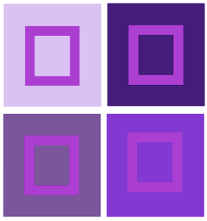

Primary hues that are pure and intense are not much affected by adjacent hues but subdued colors and colors that are not primary can change appearance drastically.
Size may influence the effect of simultaneous contrast.
In most cases, larger areas of color have more influence on smaller areas of color. The small orange square is changed by the color of the red or yellow field (the ground) and not vice versa.
Color, Value and Hue:http://char.txa.cornell.edu/language/element/color/color.htm
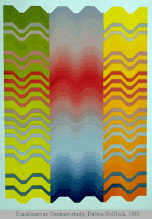
Some of the bands extend from the center panel to intrude into areas of contrasting hue in the side panels. These extended bands are in fact the same hue and value throughout, but appear to change from left to right.
•Successive Contrast happens when a given color is viewed in one environment (one color background) and then in another in quick succession. The color will be modified relative to these new surroundings as illustrated in the figure below (http://www.blogger.com/Successive%20contrast%20happens%20when%20a%20given%20color%20is%20viewed%20in%20one%20environment%20%28one%20color%20background%29%20and%20then%20in%20another%20in%20quick%20succession.%20The%20color%20will%20be%20modified%20relative%20to%20these%20new%20surroundings%20as%20illustrated%20in%20the%20figure%20below%20%28http://personal.uncc.edu/lagaro/cwg/color/color_percept.html%29.).
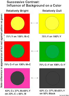
"Bezold Effect" is when a given color will appear darker and brighter when surrounded by black, and softer and less bright when surrounded by white.
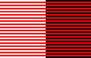
Afterimage is an optical illusion that refers to an image continuing to appear in one's vision after the exposure to the original image has ceased (Wikipedia).
Afterimage test:
http://radio.weblogs.com/0101365/stories/2003/06/27/afterImageTest.html
Interactions of color:
All colors seem lighter and more dramatic against black.
All colors seem cooler and more subdued against white.
Dark colors look darker against light colors than against dark colors.
Light colors look lighter against dark colors than against light colors.
Colors are influenced in hue by adjacent colors, each coloring its neighbor with its own
compliment.
If two compliment colors lay side by side, the contrast makes each look more
intense than it looks by itself.
Dark hues on a dark background that is not complimentary appear weaker, or less
intense, then they do on a complimentary background.
Light colors on a light background that is not complimentary appear weaker, or
less intense than they do on a complimentary background.
A bright color set against a dull color of the same hue deadens the dull color.
When a bright color is set against a dull color, the contrast is strongest when the
latter is complimentary.
Light colors on light backgrounds that are not complimentary can be strengthened
if bounded by narrow bands of black or of complimentary colors.
Dark colors on dark backgrounds that are not complimentary can be greatly
strengthened if bounded by narrow white or complimentary colors.
The greatest afterimage appears when figure and background relationships have
the same value , and when a large background is set behind a small foreground figure.
Afterimage- an afterimage is an optical illusion that refers to an image continuing to
appear in one's vision after the exposure to the original image has ceased (Wikipedia).
Color Vision & Art
http://www.webexhibits.org/colorart/contrast.html
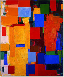
3/27/09
Assignment #7
Simultaneous Contrast Design Painting
Directions:
Select from the above interactions of color to create a pair of designs that show simultaneous contrast.
Materials:
14" x 8" Bristol Board/Illustration Board (preferred), Ruler, Triangle, Compass, Protractor, Hard Pencil (2H, 4H), Removable Tape, Xacto knife, Goldens Acrylic Paints, Brushes…
References- All swatches from the semester can be referred to for color ideas.
1. Begin by developing your design in your sketchbook. Create a 2 1/2” square for your design that contains two or more geometric shapes in addition to the background. This square design can range from simple to slightly more complex but, more importantly, it should be a design that can create a more interesting pattern when repeated in a grid. Consider the placement of your shapes and how the edges may create new shapes when aligned with the edges of the next square. Consider using tessellations.
2. Prepare your surface: On a 14” x 8” Bristol/ illustration board tape off and define a 1 1/2" border on 4 sides to create a 11” x 5" rectangle design space. Break the rectangular space down into two 5" x 5" squares with a 1" space in between them.
3. Design: Within the drawn 5” x 5" squares, recreate your design using a ruler, compass, stencils, tracing paper and/or transfer paper for precise measurements. Divide your each square space into a 2 x 2 pattern that creates a 4 square grid. Keep your borders clean. Place your 2.5” square design repeatedly into the 2 x 2 grid composition.
4. Swatches:
• Choose colors from any of your swatch scales, the Itten wheel or star. Color choices and how many are used will be based on which interaction of color you choose to present. Make 1 1/2" x 1 1/2" swatches of these colors and place them in your sketchbook next to your design.
• When creating your 1 1/2" x 1 1/2"swatches put the paint on evenly without too much texture. Do not dilute the paint. We want to see the exact color of the pigment.
Tips:
* Step back and make wise choices when picking out your palette.
*Think about how colors interact. Move the swatches around to see how the colors look next to each other and if they are not working choose new ones.
*Put your swatches and palette choice in your sketchbook.
*Mix your paint with a palette knife
*Record on the backs of your swatches or in your sketchbooks what your mixture consists of--colors, measurements
4. Painting: Choose colors based on the interaction you plan to show. Decide where your colors make the most sense and focus on how they interact. Assign colors to your design. Your paint should be opaque.
Keep your design simple. Your design should be painted in a neat and flat manner. Punctual completion, presentation and accuracy of color mixing are the primary factors in determining your grade.
Design:
Tessellations:
A tessellation is a design that combines art and math. It is a design made from a shape repeated over and over and that fits into itself on all sides. Some geometric shapes tessellate and fit together perfectly.
Tessellations. org
http://www.tessellations.org/index.htm
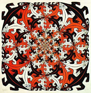
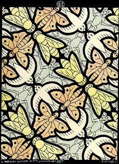
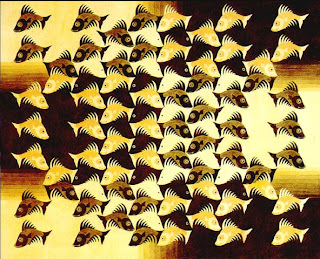
Film: The Fantastic World of M.C. Escher
Tesselation
To make a tessellation you need to create a pattern of repeating shapes which leaves no spaces or overlaps between its pieces. Tessellations are made by reflecting (flipping), translating (sliding) and rotating (turning) the two-dimensional shape or shapes that you choose to use. Your choice of colours for each of the shapes adds further beauty to your design.
http://www.cap.nsw.edu.au/bb_site_intro/stage2_Modules/tesselations/tesselations.htm
Tesselation Handout
http://mathforum.org/sum95/suzanne/whattess.html
http://www2.spsu.edu/math/tile/grammer/
http://tessellations.org/index.htm

No comments:
Post a Comment