3/27/09
Sketchbook exercise: Create 3 monochrome gradation scales. Each grid will be 7”x 1". Use black or white to vary value of the chosen hue.

#2 Analogous: Colors closely related and adjacent on the color wheel. Variations of one color family by the addition of neighboring colors on the wheel (ex. Yellow, yellow-orange, orange).
3/27/09
Sketchbook exercise: Create 3 analogous gradation scales. Each grid will be 7”x 1".
Suggestion: choose a primary color and mix 5 separate steps to the next secondary (ex. yellow to orange)

#3 Complementary: a color scheme incorporating opposite hues on the color wheel. They accentuate each other in juxtaposition and neutralize each other when mixed.
3/27/09
Sketchbook exercise: Create 3 complementary gradation scales. Each grid will be 7”x 1".

#4 Split Complementary: a color and the two colors on either side of its complement.
3/27/09
Sketchbook exercise: Create 3 split complementary swatch scales. Each grid will be 3"x 1".

#5 Color Triad: three colors spaced equally apart on the color wheel forming a triangle (your chosen triad colors will always have three other colors between them on the color wheel).
3/27/09
Sketchbook exercise: Create 3 color triad swatch scales. Each grid will be 3"x 1".

#6 Color Tetrad: Four colors selected to create harmony. Either: four equally spaced hues that are two sets of complements or four hues that are two sets of split complements (for example: select a complementary pair and instead of using them, use their neighbors).
3/27/09
Sketchbook exercise: Create 3 color tetrad swatch scales. Each grid will be 3"x 1".

3/27/09 Assignment #8 Color Schemes
Directions:
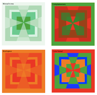
Create a design of your liking. Then, create four different color variations of that design using a different color harmony for each. Please state, which color harmony you are using in each variation when submitting your project.
Materials:
14" x 14" Illustration Board, Ruler, Triangle, Compass, Protractor, Hard Pencil (2H, 4H), Removable Tape, Xacto knife, Goldens Acrylic Paints, Brushes…
References- Itten Wheel and Star, Color Scheme Swatches
1. Begin by developing your design in your sketchbook. Create a 2 1/2” square for your design that contains two or more geometric shapes in addition to the background. This square design can range from simple to slightly more complex but, more importantly, it should be a design that can create a more interesting pattern when repeated in a grid. Consider the placement of your shapes and how the edges may create new shapes when aligned with the edges of the next square. Consider using tessellations.
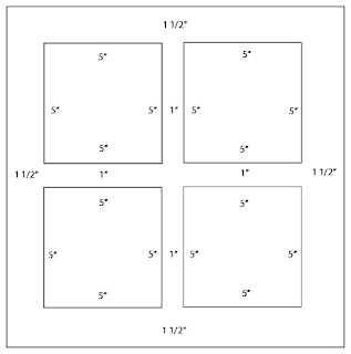
2. Prepare your surface: On a 14” x 14” Illustration board tape off and define a 1 1/2" border on 4 sides to create a 11” x 11" rectangle design space. Break the rectangular space down into four 5" x 5" squares with a 1" space in between them.

3. Design: Within the drawn 5” x 5" squares, recreate your design using a ruler, compass, stencils, tracing paper and/or transfer paper for precise measurements. Divide your each square space into a 2 x 2 pattern that creates a 4 square grid. Keep your borders clean. Place your 2.5” square design repeatedly into the 2 x 2 grid composition.
4. Swatches:
• Choose colors from the Itten wheel, star or color scheme swatches. Color choices and how many are used will be based on which color scheme you choose to present. Make 1 1/2" x 1 1/2" swatches of these colors and place them in your sketchbook next to your design.
• When creating your 1 1/2" x 1 1/2"swatches put the paint on evenly without too much texture. Do not dilute the paint. We want to see the exact color of the pigment.
Tips:
* Step back and make wise choices when picking out your palette.
*Think about how colors interact. Move the swatches around to see how the colors look next to each other and if they are not working choose new ones.
*Put your swatches and palette choice in your sketchbook.
*Mix your paint with a palette knife
*Record on the backs of your swatches or in your sketchbooks what your mixture consists of--colors, measurements
4. Painting: Choose colors based on the color scheme/ harmony you plan to show. Decide where your colors make the most sense and think about how they interact. Assign colors to your design. Your paint should be opaque.
Keep your design simple. Your design should be painted in a neat and flat manner. Punctual completion, presentation and accuracy of color mixing are the primary factors in determining your grade.
Example:

No comments:
Post a Comment