• Often referred to as Tints or Shades
• Tint- a light color
Paint- color mixed with white paint
Watercolor- color diluted with water
Print- color made from widely placed dots (halftone)
Science- color mixed with white light
Computer- in the monitor three electron beams simulate red, blue and green phosphors to glow, tinting happens when all three beams are set comparatively high
• Shade- may indicate any dark color, or any color mixed with black
• Lightness of a color depends on the percentage of light reflected from the colored surface (lightest is white- most light is reflected, darkest is pitch black- no light is reflected. Gray- some light is partially absorbed, and partly reflected.
Grayscale
• Munsell Grayscale is divided into 10 value steps
• Munsell Notation: N (neutral) followed by a number and a / (divisor symbol)
Example- absolute black= N 0/, most black paints used in artworks and photos= N 2/, absolute white N 10/, most white paint N 9/, middle value gray- N 5/ (value of a photographer’s gray card)
• Neutral colors- without hue
• Theoretical white- absolute white
• On the Munsell scale value change is designated by a vertical scale
• Only a small amount of white paint needs to be added to make the black paint much lighter and takes a much larger amount of white paint to make a light gray appear much lighter.
• A grayscale cannot be constructed that appears uniform with equal increments of white to black or black to white are added.
• All colors that have the same Munsell value, no matter the hue reflect that same amount of light
Why value?
• In black and white photography the gradient of light and shadow on objects contain all information about form, clearly defining the objects and shows the amount and direction of light.
• Artists/ Designers create black and white preliminary sketches indication value changes for a painting or design, helping plan the relationship between light and dark areas.
• Lighting designers use preliminary drawings to plot out patterns of highlight and shadow and brightness and darkness.
2/6/09
Exercises:
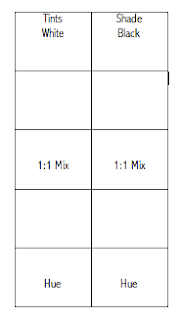
#1 In your color sketchbooks we will make Tint and Shade scales for all of your tubes of color. Each scale will have 5 sections. Begin with a grayscale. Your first color will be white, the third will be a 1:1 mix (middle gray), your last will be black and the others will fall in between. You will then make a tint scale and a shade scale for each hue.
#2 Create an 18-Step Grayscale
In order to fully understand the relationship between colors and value it is useful to begin by constructing a grayscale using black and white only. The format of this project will be 18 1.5” x 3.75” Swatches on a Bristol board. In order to gain some experience in mixing grays begin the project in your sketchbook by mixing small value swatches. Fill a page or two of the swatches and see how many subtle steps you can make between black and white. When you feel ready to move onto the 18-step grayscale begin by painting your first one out of the tube white and your last out of the tube black. The next logical step would be to mix your middle gray. After you have these three steps established mix all of the steps in between. Use your value swatches as a reference. You may have to adjust your middle gray later on in the process of completing the project. The goal of this project is to create a smooth gradation or transition from white to black. Cut your swatches out and fit them in your sketchbooks.
#3 Follow 1.2 on page 18 in Munsell. We will tape the chips together then tape them into our color sketchbooks.
#4 Try following figure 1.3 for homework. Bring your samples into class next week if possible.
2/13/09
Assignment #2
Itten Color Star
Directions:
Materials: 11” x 11” White Illustration Board, Ruler, Compass, Protractor, Hard Pencil (2H, 4H), Removable Tape, Xacto knife, Goldens Acrylic Paints, Brushes…
• Find the center of your Illustration board (5.5”) and place a point. Draw a line down the center of your board.
• From your center point you will draw 8 concentric circles using a compass. Plot a 5/8” distance for each circle beginning at the center. The measurements that will be plotted from the center outward on your line are as follows: 5/8”, 5/8”, 5/8 ”, 5/16 ”(where the star meets), 5/16”, 5/8”, 5/8”, 5/8”, 5/8 ”.
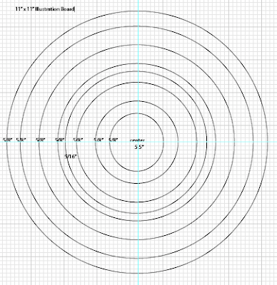
• From your center line use the outer edged of you protractor to define the 12 segments of your wheel. Start at the center line and measure and mark 15 degrees to the left and right of the line. This defines your yellow segment.
• The rest of the segments will be marked every 15 degrees. Be sure to mark on both the inner and outer circles for each segment so you can connect them in accurate radial lines (even).
• The base of your triangle will end at the ½ way between the center and the outer points.
• Paint the star matching the Itten colors and values.
Color and Design
Geometric Abstraction:
http://www.metmuseum.org/toah/hd/geab/hd_geab.htm
High Key and Low Key Painting
High Key: The painting is light or pale in value. Colors that are mixed with white ("pastels" or "tints") are high key.
Low Key: The painting is dark in value. Colors that are mixed with black ("shades") are low key.
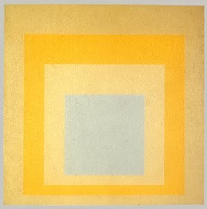
Homage to the Square: With Rays, 1959
Josef Albers (American, born Germany, 1888–1976)
Oil on Masonite; 48 1/8 x 48 1/8 in.
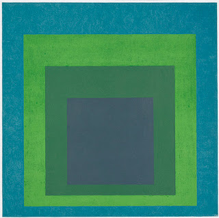
Homage to the Square: Soft Spoken, 1969
Josef Albers (American, born Germany, 1888–1976)
Oil on Masonite; 48 x 48 in.
High Key Paintings:
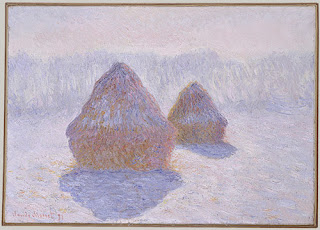
Haystacks (Effect of Snow and Sun), 1891
Claude Monet (French, 1840–1926)
Oil on canvas; 25 3/4 x 36 1/4 in.
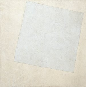 Suprematist Composition: White on White, 1918
Kazimir Malevich (Russian, 1878–1935)
Oil on canvas; 31 1/4 x 31 1/4 in.
The Museum of Modern Art, New York
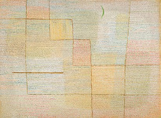
Clarification, 1932
Paul Klee (German, 1879–1940)
Oil on canvas; 27 3/4 x 37 7/8 in.
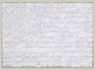
Flag, 1957
Jasper Johns (American, born 1930)
Oil on paper, mounted on paperboard; 12 x 16 3/4 in.
Low Key Paintings:
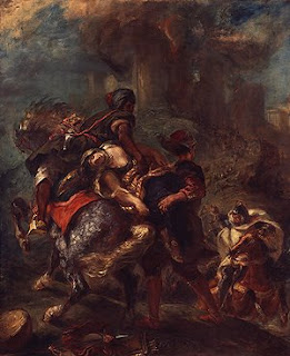
The Abduction of Rebecca, 1846
Eugène Delacroix (French, 1798–1863)
Oil on canvas; 39 1/2 x 32 1/4 in.
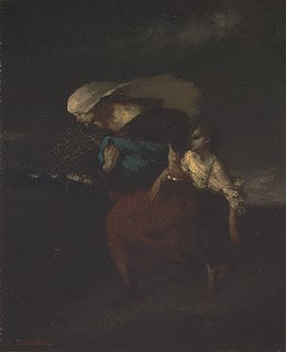
Retreat from the Storm, ca. 1846
Jean-François Millet (French, 1814–1875)
Oil on canvas; 18 1/4 x 15 in.
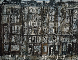
Apartment Houses, Paris, 1946
Jean Dubuffet (French, 1901–1985)
Oil with sand and charcoal on canvas; 44 7/8 x 57 3/8 in.
2/20/09
Assignment #3
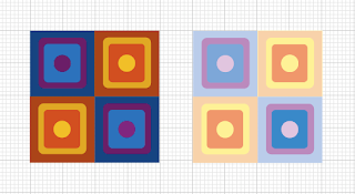
Low Key/High Key Design Painting
Directions:
Materials:
14" x 8" Bristol Board/Illustration Board (preferred), Ruler, Triangle, Compass, Protractor, Hard Pencil (2H, 4H), Removable Tape, Xacto knife, Goldens Acrylic Paints, Brushes…
References- Value Swatches, Itten Star, High Key or Low Key Value Swatches
1. Begin by developing your design in your sketchbook. Create a 2 1/2” square for your design that contains two or more geometric shapes in addition to the background. This square design can range from simple to slightly more complex but, more importantly, it should be a design that can create a more interesting pattern when repeated in a grid. Consider the placement of your shapes and how the edges may create new shapes when aligned with the edges of the next square.
2. Prepare your surface: On a 14” x 8” Bristol/ illustration board tape off and define a 1 1/2" border on 4 sides to create a 11” x 5" rectangle design space. Break the rectangular space down into two 5" x 5" squares with a 1" space in between them.
3. Design: Within the drawn 5” x 5" squares, recreate your design using a ruler, compass, stencils, tracing paper and/or transfer paper for precise measurements. Divide your each square space into a 2 x 2 pattern that creates a 4 square grid. Keep your borders clean. Place your 2.5” square design repeatedly into the 2 x 2 grid composition.
4. Swatches:
• Choose colors from either the Itten Star, or your sketchbook value swatches. You will pick a minimum of 4 either low key or high key colors and their opposites on the value scale. Your first square design will be the low key colors and the second square will be the opposite high key colors. Make 1 1/2" x 1 1/2" swatches of these colors.
• When creating your 1 1/2" x 1 1/2"swatches put the paint on evenly without too much texture. Do not dilute the paint. We want to see the exact color of the pigment.
* Step back and make wise choices when picking out your palette.
•Think about how colors interact. Move the swatches around to see how the colors look next to each other and if they are not working choose new ones.
•Put your swatches and palette choice in your sketchbook.
Tips:
- Mix your paint with a palette knife
- Record on the backs of your swatches or in your sketchbooks what your mixture consists of--colors, measurements
-Add more white for a higher key (lighter end of the grayscale) painting or more black for a lower key (darker end of the grayscale) painting.
4. Painting: Choose a minimum of 4 low key colors and their opposites on the value scale (high key) that you find interesting as a color scheme from your swatches. Decide where your colors make the most sense and keep in mind how they interact. Assign colors to your design. Your paint should be opaque.
Keep your design simple. Your design should be painted in a neat and flat manner. Punctual completion, presentation and accuracy of color mixing are the primary factors in determining your grade.
No comments:
Post a Comment