The strength or intensity of a color, the quality by which we distinguish a strong color from a weak or dull one, the amount of departure of a color from a gray of the same degree of lightness
Chroma involves the intensity and purity level in a hue that can range from fully saturated to infinite levels of neutrality.
• Neutralized or grayish colors show weak (LOW) chroma
• Intense colors show strong (HIGH) chroma
-Often referred to as bright (indicating a combination of lightness and chroma) or saturated (viewed by Munsell as a combination of value and chroma)
-Painters use the term saturation to indicate the relative proportion of pigment to filler, or medium, in paint.
-A saturated color is one with a strong chroma
• Easy to confuse chroma and value
- With chroma it is possible to have a series of colors that gradually become grayer, without becoming darker
• Hue and value scales have a definite beginning and end while chroma scales can be
extended indefinitely
-Number of chroma steps depends on the hue (more steps between gray and red than blue and red)
• Each pigment has it’s own strength and reacts differently when combined with other
pigments that will weaken it
-Pigment is most saturated when it comes directly out of the tube.
• Munsell Notation
-Chroma is noted in number form as the dividend in the Munsell hue/value/chroma notation
- Together the hue is written as a whole number followed by a letter denoting the color name followed by the value number placed over the chroma number in the form of a fraction (example- 5R 4/14)
• Color Solid- Developed in the 1600s, color systems displayed in some kind of geometric
shape, the three dimensions- hue, value, chroma take a three dimensional form in an arrangement of all colors
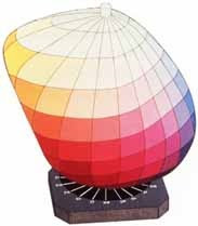
http://www.coloracademy.co.uk/ColorAcademy%202006/subjects/munsell/page3.htm
• Color Gamut- The entire range of colors—all the possible variations in hue, value, and
chroma that can be achieved in a medium or material
-Chroma defines the color range attainable in a particular medium
-The medium affects the possible number of chroma steps
Experiment with several ways to lower the chroma in these exercises in order to better control and manipulate color for your needs in the future.
Three main ways to lower chroma are:
-Tint with white
-Shade with black
-Add the compliment
2/27/09
Sketchbook Exercises
#1 Create 3 saturation gradation scales that evenly take the primary colors from their fully saturated state into their compliment. Each 1”x7” grid will start with a saturated primary (like on your color wheel) on the left side and the saturated compliment on the extreme right with the center square being the neutral middle chroma, equally between them and not closer to either saturated parent color.

Saturated primary, then 3 parts primary & one part compliment…then, 2 parts primary to one part compliment… then, one to one (even) making a neutral gray that is neither closer to one or the other saturated colors…
#2 Create another three transitions of the primaries to compliment colors while tinting them with white. Choose from your grayscales a level of light that is closer to white.

#3 Create another three transitions of the primaries to compliment colors while shading them with black. Choose from your grayscale a level of light that is closer to a dark gray and yet a level that still allows for the color to be recognizable.

Remember to label these Chroma Studies
Assignment #4
Saturated/ Neutral Transition Design
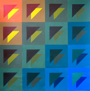
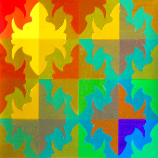
Student Samples
Directions:
Materials:
11" x 11" Bristol Board or 12" x 12"Illustration Board (preferred), Ruler, Triangle, Compass, Protractor, Hard Pencil (2H, 4H), Removable Tape, Xacto knife, Goldens Acrylic Paints, Brushes…
References- Chroma/Saturation scales
Saturation or Chroma: relates to the degree of purity of a color. Contrast of saturation is the contrast between pure, intense colors and dull, diluted colors.
1. Begin by developing your design in your sketchbook. Create a 2.5” square for your design that contains two or more geometric shapes in addition to the background. This square design can range from simple to slightly more complex but, more importantly, it should be a design that can create a more interesting pattern when repeated in a grid. Consider the placement of your shapes and how the edges may create new shapes when aligned with the edges of the next square.
2. Prepare your surface: On a 12”x12” illustration board tape off and define a 1" border on 4 sides to create a 10” square design space or on an 11” x 11” Bristol board and define a 1/2" border on 4 sides.
3. Design: Within the drawn 10” square, recreate your design using a ruler, compass, stencils, tracing paper and/or transfer paper for precise measurements. Divide your space into a 4 x 4 pattern that creates a 16 square grid. Keep your borders clean. When placing your 2.5” square design into the 4x4 grid composition, you may opt to rotate or flip (mirror image) the design square in order to create a more visually interesting design.
4. Painting: Choose 3 pairs of complement 7-step transitions that you find interesting as a color scheme from the chroma studies in your sketchbook. At least one must be a saturated transition. Your goal is to work diagonally from one corner to the opposite corner of the grid. So you need to assign a color (transition) to each shape in your repeated 2.5” square (including background areas as a shape).
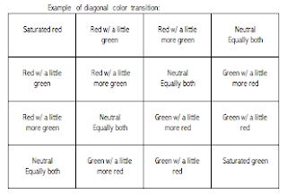
For example: if your design was a simple circle and a square inside the 2.5” square, the background would consist of one of your designated transitions and shift from one color to the opposite in 7 steps- corner to corner. Likewise, the circle in the corner square would start as the beginning color of another chosen transition and then become the compliment of that color in a smooth transition towards the opposite corner. The square will transition in the same way.
Your transitions should happen in 7 steps, so you will work diagonally from one corner to another. Background color transitions and shape color transitions may change in the same or different diagonal paths (For example: maybe the background color goes from top left to bottom right while the shape (s) in the square design transforms into it’s compliment from top right to bottom left).
Keep your design simple. Your design should be painted in a neat and flat manner. Punctual completion, presentation and accuracy of color mixing are the primary factors in determining your grade.
Using Hue, Value and Chroma
Assignment #5
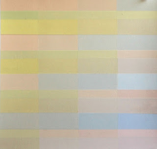
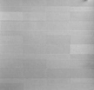
Equal Value/ Invisible Painting
Student Sample
Directions:
Materials:
11" x 11" Bristol Board or 12" x 12"Illustration Board (preferred), Ruler, Triangle, Compass, Protractor, Hard Pencil (2H, 4H), Removable Tape, Xacto knife, Goldens Acrylic Paints, Brushes…
References- Value scales, Itten star, Munsell Color Chart Pages, Chroma scales
1. Begin by developing your design in your sketchbook. Create a 2.5” square for your design that contains two or more geometric shapes in addition to the background. This square design can range from simple to slightly more complex but, more importantly, it should be a design that can create a more interesting pattern when repeated in a grid. Consider the placement of your shapes and how the edges may create new shapes when aligned with the edges of the next square.
2. Prepare your surface: On a 12”x12” illustration board tape off and define a 1" border on 4 sides to create a 10” square design space or on an 11” x 11” Bristol board and define a 1/2" border on 4 sides.
3. Design: Within the drawn 10” square, recreate your design using a ruler, compass, stencils, tracing paper and/or transfer paper for precise measurements. Divide your space into a 4 x 4 pattern that creates a 16 square grid. Keep your borders clean. When placing your 2.5” square design into the 4x4 grid composition, you may opt to rotate or flip (mirror image) the design square in order to create a more visually interesting design.
4. Value: Choose a single value for your design by looking at your grayscale and color chip charts in the Munsell text. If you normally tend to work in high key (lighter end of the grayscale), middle key (middle values of the grayscale) or low key (darker end of the grayscale) it would be wise to choose a different value for this exercise. The object of the assignment is to create a simple, yet interesting, design that is composed of at least 10 colors that are all the same in value.
You can vary your palette with different hues and variations of hues. You can alter the chroma (saturation) of them as long as you maintain a single value for the design. Adding black and white will be necessary to generate your targeted value. Remember, adding a compliment to a color may lower the chroma without dramatically changing the value level.
The idea is that you produce an outcome that could be photographed in black and white, or scanned into the computer in grayscale, and it would appear somewhat invisible. * Because of the nature of film and Xerox machines, this is more theory than consistent fact.
Keep your design simple. Your design should be painted in a neat and flat manner. Punctual completion, presentation and accuracy of color mixing are the primary factors in determining your grade.
No comments:
Post a Comment